Create a mobile version of your site with just CSS!
A few week’s or so back Luke was showing off his new Responsive CV at work, which had the rather cool feature of instantly resizing itself to fit pretty much any screen size – even mobile. The magic behind all this, rather than any nifty bit of JavaScript, tuned out to be CSS Media Queries, a CSS feature I’d never really paid much attention to beforehand.
The basic idea behind CSS Media Queries is to give web developers the power to tell the browser to apply extra CSS when certain conditions are met. The most useful condition in regards to creating a mobile version of your site website the being browser width’s. As a rough example of how they work, imagine for example you have a website with a default width of 1000px and a user then resizes their browser window to 950px wide.
Using the following code snippet, once the users browser window has been resized to below 1000px the enclosed CSS will be instantly applied to the page, changing the containers width to 900.
@media only screen and (max-width: 1000px) {
	#container {width:900px !important; }
}
The real advantage’s of Media Queries over a standard fluid layout start to show up when you get to the significantly different screen resolutions, for example the 320px width of a mobile phone browser. Since Media Queries allow you to selectively apply whole chunks of additional CSS, you can use it to totally rearrange elements on the page in order to ensure your site remains functional at any resolution. Have a go at resizing this site for instance, the first big change to happen is the removal of the sidebar (at 720px), which coincides with the search bar being moved up to the top. The next big one happens when the site is transformed fully in to the mobile site (at 450px) which has quite substantially different styling to the normal view.
If you want to apply your mobile site CSS to any screen resolution below 350px, your code my look something like this.
@media only screen and (max-width: 350px) {
	#container {width:320px !important; }
	/* Mobile Site CSS here */
}
Or, if you want to resize headings on any resolution between 600px and 800px, your code may be as follows:
@media only screen and (min-width: 600px) and (max-width: 800px) {
	h1 {font-size:0.0em;}
	/* More styles */
}
As you can see, using this technique it becomes relatively straight forward (assuming you already have a good grasp of CSS) to create a mobile version of your site by just altering and adjusting a few of its styles.
One thing you may notice though, is that even if your Mobile Site styles work fine when you resize your browser window to the correct size, your actual mobile phone’s browser still shows the desktop version.
In order to get your mobile CSS styles to be applied correctly, its important to tell the mobile browser that you want everything rendered at its real size (as opposed to the zoomed out view they normally try to adopt when encountering desktop sites).
To do this, you’ll need to ad a veiwport meta tag to your websites header;
<meta name="viewport" content="width=device-width, initial-scale=1, maximum-scale=1" />
Once that’s done your mobile CSS should start showing up on your phone just as you would expect it to.
Having only recently added CSS Media Queries to this site, I’m still incredibly impressed with them. CSS Media Queries turn the rather substantial job of creating an alternate mobile friendly version of your site in to about half an hour’s CSS. Awesome, no?
JavaScript eyes that follow the cursor.
I remember one of the first tutorials I wrote back on my old thybag website was on how to get eyes that follow the cursor using Flash. I’d initially worked out how to do it in order to animate the alien in my banner a little and although the effect can be a little disconcerting at times, I kinda liked it.
For that reason I decided to set myself the challenge of getting the functionality back, only this time using JavaScript instead of flash. Rather than waste space with extra images I also decided I may as well draw the eyes with canvas while I was at it.
The aim of this little tutorial will be to show you how to create something like this.
(Though you will more likely want to use your own image.)
If your not really intested in how its done and just want the script, feel free to grab it from here. You can create eye’s by calling
//Variables are just used to make it obvious what each parameter is,
//you can call the functions with the param's directly if you prefer.
var positionFromLeft = 200;
var positionFromTop = 50;
var eyeSize = 30;
var appendEyetoDivNamed = 'mydiv';
new alienEye(positionFromLeft,positionFromTop,eyeSize,appendEyetoDivNamed);
If your interested to see how the eyes following the cursor script works, keep reading after the jump.
Image-switcher snippet
Since my plan today was to start working on creating the portfolio/past work section of this site, I decided to start by creating a few simple snippets that I thought would likely come in handy.
The first of these being a simple image switcher. The idea behind the snippet was pretty much to just be able to put some images inside a div with a particular class and have the snippet do all the work. A little bit of dojo later and the below is the result.


(images “borrowed” from the interweb)
To use the snippet all you need to add Dojo to the page, then import the jsnippet CSS and JavaScript files. After that just add a div to the page with the class “jsnipImageSwitcher”. The above Image switcher for instance is actually just the following HTML wirtten in to the page.
<div class="jsnipImageSwitcher" style="width: 400px;">
    <img src="/demo/img/skunk.jpg" alt="A baby skunk!" />
    <img src="/demo/img/otter.jpg" alt="An otter" />
    <img src="/demo/img/bunny.jpg" alt="A Bunny Rabbit" />
    <img src="/demo/img/seal.jpg" alt="Upside down Seal" />
    <img src="/demo/img/kittendog.jpg" alt="A Kitten sleeping next to a big dog" />
</div>
The snippet will work out the amount of images dynamically so there are no limits to how many can be used within it. The only limitation to the above being that the default styles may not leave room to fit the dots. As you may have noticed the snippet also pulls it’s caption from the images alt attribute, which has the added bonus of improving the images ability to be found by search.
If for any reason JavaScript is not enabled in a user’s browser the images will display normally without any side-effects as a result of being part of the snippet. The snippet is tested in Firefox, Chrome and IE9.
If your interested in knowing how the snippet works, keep reading after the jump for a full explanation.
Recent Stuff
Since I couldn’t think of anything in particular to Blog about, I thought I may as well quickly try and summarise all the random bits and bobs I’ve been working on and hacking at over the past few months.
A Javascript Game

JavaScript Game
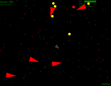
Prior to starting this little project the closest thing I’d ever created to an actual game was a text based World of Zull mod as part of my Degree’s java module. Despite this I had always wanted to try my hand at creating a simple game and thought now was as good a time as any to have a go. Since I knew so little about creating games I opted to try and do it in a language I was relatively comfortable in, JavaScript. The added advantage of this also being that anyone with a modern web browser would be able to play it without the worry of having to install anything extra. Since my main aim with this project was to learn exactly how to create games myself, the whole thing is built in pure self coded JS, without the aid of any pre-existing game building frameworks.
The game itself is more or less an asteroids style space shooter, except with a infinite-ish game-play area (something that proved far more challenging than i had originally envisioned due to the need to unload and reload star fields in order to prevent browsers slowing to a halt.) To simplify the code i created a basic javascript inheritance mechanism and a number of distinct objects to manage the different elements of the game, star fields, your ship, enemy ship’s the HUD etc. The majority of the GUI consists of DOM elements absolutly positioned relative to a central div, with the ships drawn with the HTML 5 canvas API.
Over all the most challenging aspects of the whole endeavour proved to be coming up with a relatively accurate collision detection mechanism that wouldn’t bring browsers to a crawl.
The game can be played online from my (still in development) website Thybag.co.uk‘s holding page – although my latest collision detection algorithm has yet to be added to the live version.
An Updated version of the Magic Framework

Magic V2
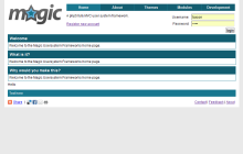
The new version of magic was written partially in response to working on a reasonably large CakePHP project and wanting to get a better understanding of how MVC pattern PHP frameworks really work. Additionally it provides me with a nice starting point for small projects in which I want to use the MVC design pattern, yet want to avoid the overhead associated with many of the larger PHP frameworks (Since they are often significant overkill for a lot of smaller projects).
The new version is a ground up rewrite including;
- Ultra Light MVC framework, with a router and fully PHP enabled Views.
- Database managed via PEAR
- A set of base modules to provide all the functionality needed for a basic user system.
- New default theme
- Basic templating support
Since the new version of magic was originally developed as an independent side project it’s currently still within my own local SVN repository rather than the google code project. Once I get it to a usable state I will overwrite my now defunct Google code copy with the new one.
DIY Uber Desktop

Uber Case
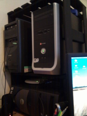
Since space is hard to come by in student accommodation, I spent a weekend on a DIY project to try and make better use of mine. Using a load of scrap wood, screws and a small tub of black paint a few friends (Ryan and Amy) and I set about constructing a custom container for my working desktop, gaming desktop and server pc (Which both runs my Minecraft server and streams my media around the house). In addition is also provides me with an extra shelf and somewhere to fit the switch, wireless router and external hard-drives.
Import & export MySQL database’s via the command line.
If your website, webapp or forum has a particularly large database, backing the database up or restoring it via PhpMyAdmin (or similar tools) can often cease to be an option. PhpMyAdmin for instance will generally struggle with files over 5MB, which isn’t all that helpful when your sites database is in the hundreds of megabytes, if not the gigabytes.
The solution, if shell access is available, is to switch to using shell commands instead. Once logged in to the server (via putty or the terminal of your a linux or OSX user) backing up the database is as simple as running
mysqldump --opt -h yourDBHost -u yourUsername -p yourDBName > backupfile.sql
(obviously with yourDBHost, yourUsername and yourDBName changed to whatever they are for your server)
Restoring the database again can be just as easy, using a command such as
cat file_to_import.sql | mysql -u yourUsername -p yourPassword -h yourDBHost yourDBName
Or if the server is windows based (Useful for importing database’s in to local WAMP or XAMPP databases)
type file_to_import.sql | mysql -u yourUsername -p yourPassword -h yourDBHost yourDBName
will perform much the same action.